


You will have gathered that the labels on the Between Five Bells wines are a little different. There are two things at play here.
In the very early days, long before we had a feeling for the aesthetics of the labels, we had some convictions about what should, and should not, be on them. Now, I know that very few people care about wine labels, but we still felt it important to let people know they can access that information if they want it. And, even if it's a side-effect, to let people know that there's nothing about the wines we are trying to hide. The labels on these wines should tell you something about the wine inside, be honest about it, and maybe even inspire a bit of research.
Like most winemakers Ray kept all the information on the vineyards, vintage conditions, ferments and finished wines from that first vintage in 2009/10 in his head. Like a good wine wholesaler Dave kept the data on a spreadsheet.
It’s at this point in the tale, we can introduce Nicholas Felton. Dave & Nick share a great-grandfather, and we doubt securing the services of one of the world’s leading designers would have happened without this piece of serendipity. Nick specialises in turning data into graphics, and it is this unique skill that linked the first idea to the second- that the label should also be beautiful.
So, if you take the RED & WHITE labels, you will see the central image as something alluring and interesting. This is actually all the data of the various grape varieties as they entered the winery and went through primary fermentation. There are eight axis at play, including the heat of the ferments, the time on skins and the ripeness of the grapes.
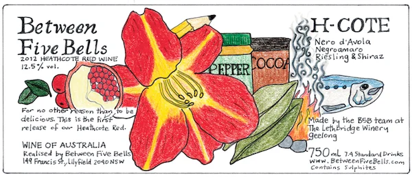
When we starting making wines under our "Italian influenced" range, the H-COTE & NEB, we asked the Californian wine writer & illustrator, Hawk Wakawaka (aka Elaine Chukan Brown), to draw her interpretations of the wines, extending the theme of insight on the labels. Elaine has now produce five unique labels for us.
“When it came time for the first vintage red to be bottled, Fesq turned to a leading infographics designer, Nick Felton, who reimagined all the nerdy data about the wine - grape varieties, fermentation temperatures, days on skins, everything - as one of the most beautiful, lyrical labels ever to grace an Australian wine bottle.”